Why Brand Consistency Matters: Building Trust, Recognition, and Results for Small Businesses
When you're building a business from the ground up, you're wearing all the hats—and sometimes branding is the one that gets tossed into the “I’ll figure this out later” pile. We get it. But here's the truth: continuity in your brand application isn’t just a “nice to have”—it’s one of the quiet power moves that can transform how your audience sees (and trusts) you.
Whether you're just starting out or you're ready to level up your visual identity, this post will walk you through why brand consistency matters, how it shows up in your business, and a few gentle steps you can take to bring it all together.
What Is Brand Continuity?

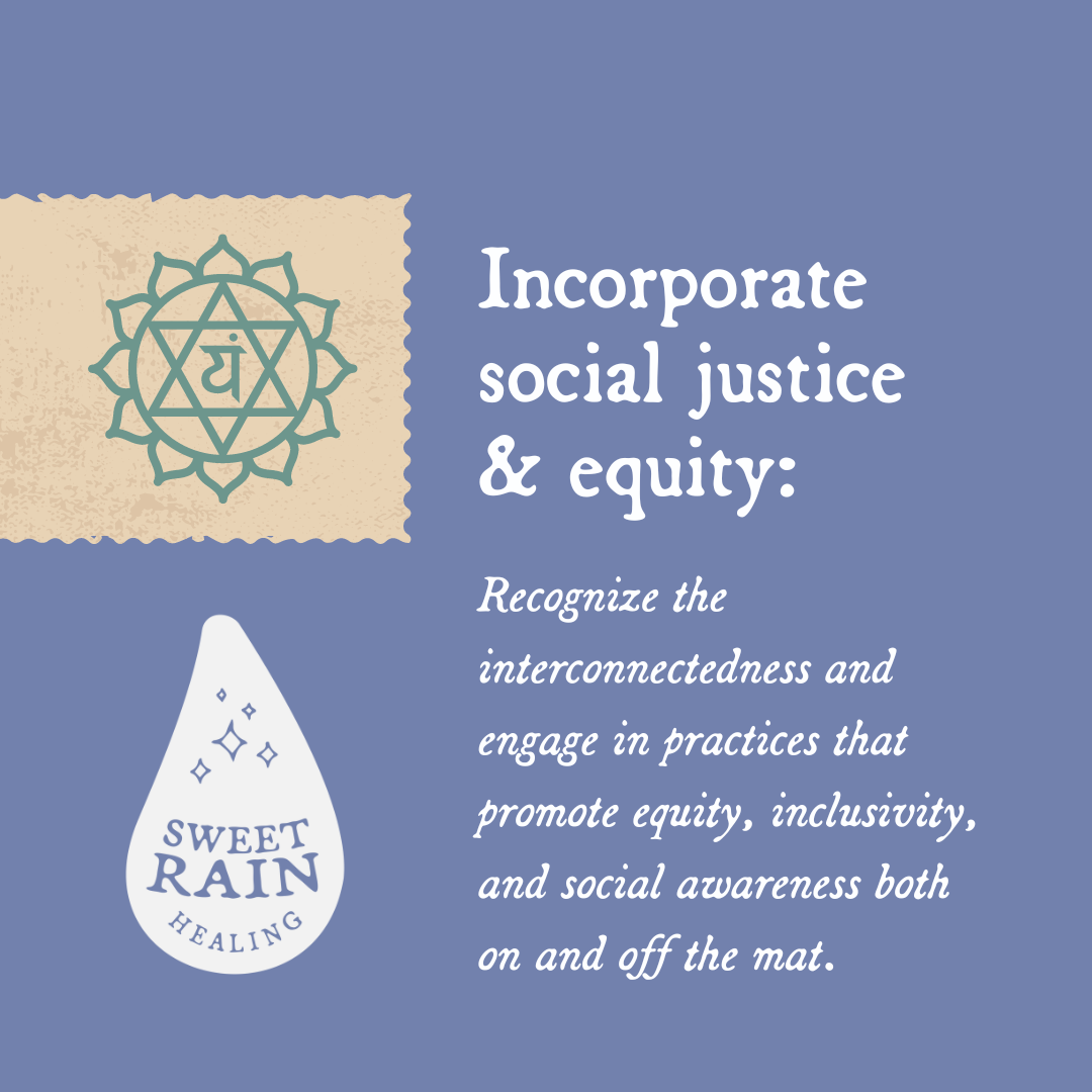
Sweet Rain Healing’s color palette helps to keep them consistent.
Brand continuity (also called brand consistency) is the practice of applying your brand’s visuals and messaging the same way across every platform and customer touchpoint. That means your logo, color palette, typefaces, tone of voice, photography style—even the way your packaging or signage looks—should feel cohesive and intentional.
Steve Job’s uniform of a black turtleneck and jeans is a great example of this being put into practice and it becoming a recognizable look for his iconic brand. The consistency is key.
BUT! You don’t need to be robotic or boring to be consistent. Think of brand continuity as letting you show up more creatively.
Why It Matters for Small Businesses
Your brand doesn’t need to be big to be powerful. In fact, small businesses that are consistent with their brand application often have an easier time building a loyal audience—because there’s less confusion, more connection, and a sense of trust built into every interaction.
Here’s what strong brand continuity can do for you:
Build trust. When your visuals are consistent, your business looks reliable and professional.
Increase recognition. Repetition helps your audience remember you. (That’s why it works for the big brands—and it works for small ones too!)
Support your reputation. A polished presence tells the world you're intentional about your work and committed to quality.
Minimize confusion. When people see your logo, posts, and packaging, they know what to expect.
Boost your marketing. The more recognizable your brand, the more effective your promotions will be.


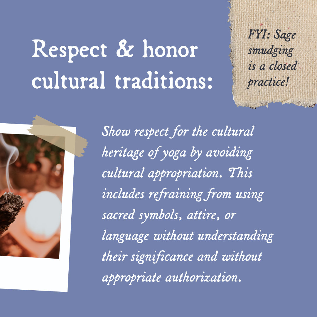
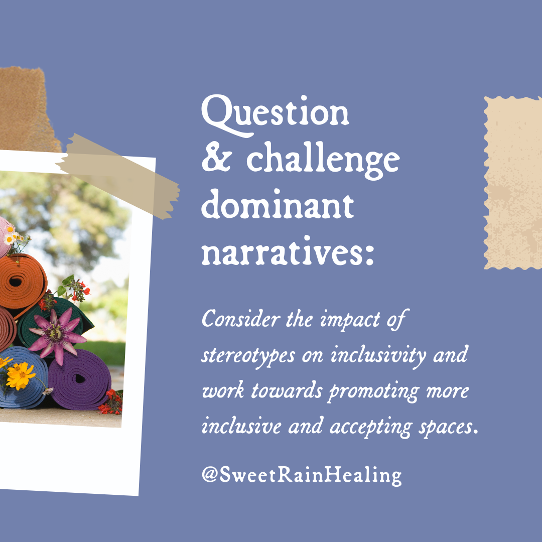
Sweet Rain Healing has done an impeccable job of utilizing the templates we created for them.
Common Brand Inconsistencies to Watch For
We’ve all seen it (and maybe done it): a stretched-out logo, an off-brand Canva post, or a newsletter that feels like it came from a totally different business. These things are so normal, and they don’t mean you’re doing a bad job—they just mean your brand might be asking for a little more structure and support.
Here are some of the most common inconsistencies we see (and help clients solve):
Mixed photo styles. Maybe one post is bright and airy, the next is moody and dark. Or you're using both personal photos and stock images with clashing vibes. Having a clear visual style can help reinforce your brand's personality.
Changing tone of voice. If your emails sound super casual but your website reads stiff and formal, it creates a disconnect. Try to speak with one consistent voice—yours.
Disjointed packaging or signage. If your digital presence feels high-end but your printed materials or signage don’t match, it can feel jarring for customers.
Logo misplacement or distortion. This one is big. Sometimes the only logo file you have is a JPEG on a white background—so you avoid using it altogether or pop it into a design where it looks just a little off. That’s not your fault. Many small businesses aren't given the proper logo file types (like transparent PNGs or vector formats), which makes consistent use feel frustrating or impossible. We always recommend clients have a clean, transparent version of their logo and a mini brand guide for quick reference.
Inconsistent fonts and colors. Swapping fonts or color tones might seem minor, but it chips away at the cohesiveness of your brand. Choose a palette and stick to it—this helps every piece of content feel connected.
Remember: these inconsistencies are totally fixable. You don’t need to overhaul your brand overnight—small steps make a big difference.
How to Stay Consistent Without Losing Your Mind

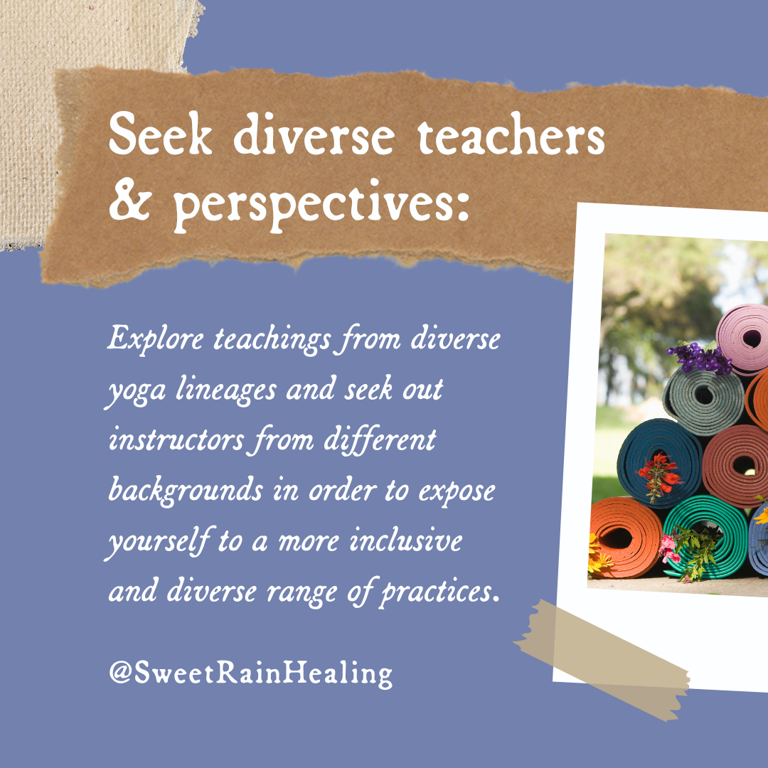
All of the easy-to-use brand elements that were provided to Sweet Rain Healing help them keep things interesting, stay on-brand, and work smarter—not harder.
We know life as a business owner is full—and adding “brand manager” to your list might feel like a lot. But the good news? You can absolutely simplify this process.
Here’s how:
Create a brand guide. This doesn’t need to be a 40-page document. Even a one-pager with your logo, color codes, fonts, and sample images is a helpful anchor.
Use templates. Canva, Adobe Express, or even Google Slides can house templates for social media posts, presentations, or emails.
Audit your brand quarterly. Take a look at your website, posts, packaging, and emails to check for alignment. What’s feeling “off”? What’s totally on point?
Loop in your team. If you have help—whether that’s a VA, social media manager, or printer—make sure they’re using the correct files and guidelines.
Ask for support. It can be hard to ask for help, but sometimes you just need a fresh set of eyes (or a creative partner who lives for this stuff—hi!). It helps you focus on what you do so well!
The Payoff of Brand Continuity
When you keep your brand consistent, amazing things happen:
You feel more confident in your business’s appearance.
Clients start to recognize you immediately.
Your content takes less time to create because your foundation is already there.
You look and feel more confident, which lets you charge what you’re worth.
And best of all—you stop second-guessing every visual decision and start showing up with clarity and ease.
That’s what we want for you.
You Don’t Have to Be Perfect—You Just Have to Start

Post by Erica Cundiff of Blue Honey Rose
Every business has a starting point. If your branding feels scattered right now, that’s okay. You’re not behind—you’re just on your way. Think of consistency as a muscle. The more you flex it, the stronger your brand becomes.
If you’re ready to take some of the guesswork out of your visuals—or if you just want to finally get a transparent version of your logo (the struggle is REAL)—we’d love to help.
Let’s build a brand that works for you, not one that creates more work for you.
Want to check out more from Sweet Rain Healing and see the work in action?